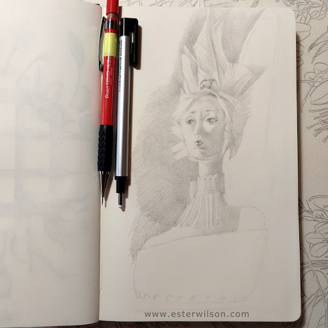
someone has suggested to me that I don't use enough blue in my palette, which is true. I put a smidge bit in this painting, and it's so subtle that it's barely noticeable. Maybe I'll get more brave about blue soon.
Beautiful color in this one. (Blue or no blue) It is very warm which is an interesting contrast to the eskimo who I would expect to see with much cooler colors. As always, great composition.
 someone has suggested to me that I don't use enough blue in my palette, which is true. I put a smidge bit in this painting, and it's so subtle that it's barely noticeable. Maybe I'll get more brave about blue soon.
Looks great.
ReplyDeleteI think the blue was a nice touch. It makes the light enter the shadows.
:)=
Beautiful color in this one. (Blue or no blue) It is very warm which is an interesting contrast to the eskimo who I would expect to see with much cooler colors. As always, great composition.
ReplyDeletethanks both! I really appreciate your thoughts :)
ReplyDeletebeautiful painting... and i had to chuckle when i read about the blue. blue is my "over used" color!
ReplyDeletenice to see your work.